
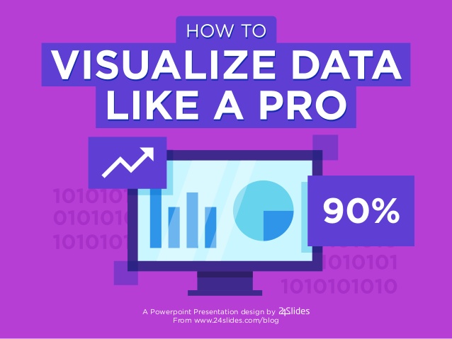
Present Your Data Effectively
shared by: Nugroho J. Setiadi, PhD
LinkedIn: https://www.linkedin.com/in/nugroho-j-setiadi-8b9b0116/
Google citation index: https://scholar.google.com/citations?user=7kvetHUAAAAJ#%21
Source: https://www.slideshare.net/24Slides/how-to-visualize-data-like-a-pro
| While a good presentation often includes data, data alone doesn’t guarantee a good presentation. To avoid confusing your audience, keep it simple. Ask yourself, “What’s the single most important learning I want my audience to extract from this data?” Next, make sure your charts are readable. What’s discernible on your laptop may be far less so when projected on a screen. Rehearse your presentation with colleagues sitting as far away — where the actual audience will sit. If they can’t see your charts clearly, redesign them to be easier on the eyes. Also, clarity is crucial. Use precise language to identify X and Y axes, pie pieces, bars, and other chart elements. Try to avoid abbreviations that aren’t obvious, and don’t assume people will remember the labels on previous slides. Last, avoid generic titles. For example, instead of “Millennial Preferences,” try a more specific title like “Millennials Prefer Mobile.” This is the first element the audience will notice and process, so it pays to get it right. |
| This tip is adapted from “Present Your Data Like a Pro,” by Joel Schwartzberg |
Source: Schwartzberg, J. (2020). Present Your Data Like a Pro. Harvard Business Review. From: https://hbr.org/2020/02/present-your-data-like-a-pro?utm_medium=email&utm_source=newsletter_daily&utm_campaign=mtod_notactsubs . Retrieved on Mar 11, 2020, 3:36 PM

-
Brian Richard - 2001580321 Presenting data usually comes out with numbers and those numbers might be too small because we are presenting a lot of data. Re-designing our material is very important because if not, it would be useless if the audience couldn't see at all and they will not fully understand the material that we are presenting at the moment. So, it's okay to take longer in designing the material as long as the audience can see what's happening on the slide presentation.
-
Monica Vania Stephanie (2001590796) Monica Vania Stephanie / 2001590796. This article is about what audience will take from the presentation, it’s not only how many numbers/ graphics that will be show in a presentation. When we present something, we have to make a good presentation. The good presentation means it includes all the data that we will discuss, the graphic draw well and clearly, good design, etc. So, when we present it the audience not only look at the picture, but they can understand what we will convey to them.
-
Maximilian Fajar Linus - 2001574874 Maximilian Fajar Linus - 2001574874 - LA26. Saya setuju degan artikel ini, kita harus dapat memilih data yang tepat untuk dilampirkan dalam suatu presentasi, hal ini dapat mengurangi terlalu banyaknya data yang ingin disampaikan sehingga dapat membuat audiens menjadi bingung terhadap apa yang ingin kita sampaikan. Memperhatikan desain dari materi presentasi juga menjadi hal yang penting karena pada saat membuat presentasi kita mau materi yang akan kita sampaikan dapat dilihat, dipahami, dan dimengerti oleh semua audiens sehingga semua informasi yang akan kita sampaikan dapat diterima dengan baik oleh audiens.
-
Edo Roy Edo Roy - 2001547665 From this article i learn that i must present my presentation simply and use important data only so the audience is not confuse because they will easily forget about the numbers/chart in the data if we move to the next slide. redesigning our presentation to fit the insterest of the audience is important too to keep the presentation interesting
-
Raden Mikail Akbar Aulia - 2001615205 Data is acting as evidence to support the claim and statements on the presentation. But when the presentation is lacking, data remains just that, data = potential information. Presentation plays a very important role when it comes to data because the presentation has a very big role in data. you should keep in mind that the presentation of the data must be informative and in short form. So you can easily understand the data, and the audience too.
-
Melyana Pangestu Melyana Pangestu / 2001553112 A data is very important for decision making in business. Data can be achieved in many ways and can be presented attractively through depictions of X and Y axes, pie pieces, bars, and others.
-
Afra Soraya - 2001600393 I agree, making a good presentation and attracting listeners is to imagine our position as an audience. This can help us to identify the needs of the audience, the lack of material that has been made, and know how the audience is not easily bored with the material to be explained. Thank you, Afra Soraya – 2001600393.
-
Wulandari (2001610583) Businesses are clamoring to use data to get a competitive edge, the importance of presenting data is to keep audience engaged and get message across. So, it really has to pay attention to good ways to present data effectively.
-
Verent Angelia- 2001609745 A good presentation must be clear, attract the audience, fulfill the audience needs, and specific. it must be on points not paragraphs, the points have to clear represent the whole paragraph. design on presentation also important so the audience feel excited to keep following our presentation
-
Ghia Sakanti Narendrakanyaka - 2001578374 The important part of a presentation is the data. You need to convey the information in your presentation to the audience. But if your presentation cannot make your audience understand the information, it means that your presentation failed. So you have to process the data into something interesting and make the audience understand and enjoy when you presented the material.
-
Ferrel Enoch Ibrahim Ferrel Enoch Ibrahim - 2001547671 || A good presentation is a presentation that is easy to read, easy to see, varied, and doesn't write much. presenting data with charts is a good thing because it makes data easy to read.
-
mohammad rakhel rahadian harris Mohammad Rakhel rahadian Harris/2001577226 making good and interesting presentations for listeners/audience is that we imagine our position as an listeners/audience. This can help us know the needs of the listener/audience, and the data we provide must be accurate and complete as possible. and the way we present it must be enthusiastic so that our listeners/audience aren't bored
-
Irfan Arsyad - 2001583752 in present a data we must make the presentation attractive by design the data so it make the audience focus on the presentation, then in the presentation of data we must consider where we put our position in presentation, it make the audience see more clearly to the data that are shown.
-
Bayu Pratama Bayu Pratama - 2001624336. Artikel ini memberikan informasi bahwa dalam mempresentasikan sebuah data ada tekhniknya. Terkadang audience merasa bosan jika penyaji menampilkan data - data yang jumlahnya banyak malah membuat audience bingung. Data tersebut perlu diubah keadalam grafik dan diagram , perlu juga melakukan highlight ke data yang sekiranya menjadi poin yang krusial.
-
Daniel Nalom Daniel Nalom La26 (1901497174) Thank you for sharing! Now i'm going to make sure to make my data and some of key factors of my presentation in future would be simple and understandable for my audience..
-
Irfan Arsyad - 2001583752 The point is, a good presentation is a good design of data and a good way to show data to the audience, so we must manage our data presentation by making the data can be seen to the audience, share only the point from each chart and keep it simple.
-
Jemmy Young jemmy young - 2001624651 the data is used in presentations so that the audience understands information, but unfortunately the data often uses graphics and models that have a way of conveying that is too complex and incomprehensible to all audiences. for that it is very important to clarify our data using language and delivery methods that will be understood by the general audience.
-
Calvin Sioe Calvin Sioe-2001551460 Menurut menyajikan data yang dengan baik saat presentasi merupakan hal yang sangat penting,informasi harus disampaikan dengan singkat,padat dan jelas. Salah satu caranya adalaah dengan menggunankan multimedia seperti infografis,video dan ilustrasi gambar agar audiens tidak bosan dan lebih mudah menyerap informasi.
-
2001608452-jonathan adhianto Dengan presentasi yang simpel, jelas dan menarik akan membuat orang lebih tertarik untuk melihat dan mendengarkannya
-
ade hafizh arifta ade hafizh arifta-2001596244 in this case we must be able to choose which points are more important, so they can be more easily understood by the audience. so that what we present can be understood by the audience
-
Erlyta Agustin Wilarto 2001598956 - Apa yang saya dapatkan dari artikel ini adalah bagaimana saya harus menyiapkan data yang dibutuhkan dalam sebuah presentasi . Memebuat segala menajdi hal jelas dan terlatih serta harus dapat membuat sejelas mungkin dan mendesaign ulang itu perlu jika tidak mendapat grafik jelas atas apa yang akan dipresentasikan . Sehingga mempersiapkan segala hal sebelum presentasi itu penting
-
Fatah Panji Firmansyah Fatah Panji Firmansyah (2001579780) From this article, I learned that visualization is very much needed during a presentation, starting with a design that keeps it simple and then uses existing charts to be used as info-graphic. This is done so that the information conveyed can be received better.
-
Agustin Savira - 2001604246 on this article, i learned that present data effectively by knowing the importance of learning that audience want by this data. such makes charts is readable for the audience by design it easier, and crucial of clarity. Thank you for the article, Sir. — Agustin Savira 2001604246
-
Muhammad Ragil Kesuma Putra (20015839) Visualization is the key when presenting a Data. it would attract the audiences to pay attention to your presentation
-
Muhammad Ragil Kesuma Putra (20015839) Visualization is the key when presenting a Data. it would attract the audiences to keep pay attention to your presentation
-
Muhammad Ragil Kesuma Putra (20015839) Visualization is the key when presenting a Data. it would attract the audiences to keep pay attention to your presentation, it would also make the presentation more understandable for the audiences
-
Kevin Bangun Renaldy Kevin Bangun Renaldy - 2001536453 Artikel ini baik, karena dalam presentasi, memang kita harus menampilkan hal-hal yang penting, dan tentunya dapat dimengerti dengan mudah oleh audience, dan akan lebih baik jika hal dalam artikel tersebut yang mengatakana bahwa speaker harus berpura-pura menjadi audience agar dapat mengetahui sebenarnya apa yang audience ingin dapatkan dari presentasi, tentunya tanpa mengurangi inti dan mengatakan sesuai data yang ada.
-
Sri Wulan H.T (2001548535) Making the presentation of the presentation as simple as possible and with an attractive design will make it more possible for listeners to listen to our presentation, and also use language and intonation that is precise, clear and concise so that it is easily understood by the audience
-
Clavenia Santosa - 2201773696 I definitely agree that we need present our data effectively, because no matter how many petabytes of data we’ve streamed in real-time and how sophisticated our analytics stack, if it doesn’t give the right people the right information at the right time, we’re wasting our time. And probably a whole lot of money and other resources, too. Here are my 10 tips for presenting data: 1. Recognize that presentation matters 2. Don’t scare people with numbers 3. Maximize the data pixel ratio 4. Save 3D for the movies 5. Friends don’t let friends use pie charts 6. Choose the appropriate chart 7. Don’t mix chart types for no reason 8. Don’t use axes to mislead 9. Never rely solely on color 10. Use color with intention